Plots
Every plot below comes from the package. They need matplotlib, which is an optional dependency:
If you drove the loop yourself and have a plain array, wrap it first. All of
these are methods on Result:
Diagnosing the chain
plot_trace()
The first thing to look at, always. One panel per parameter, showing the chain against iteration. You are checking that it settled somewhere and then wandered around that place, rather than drifting or sticking.
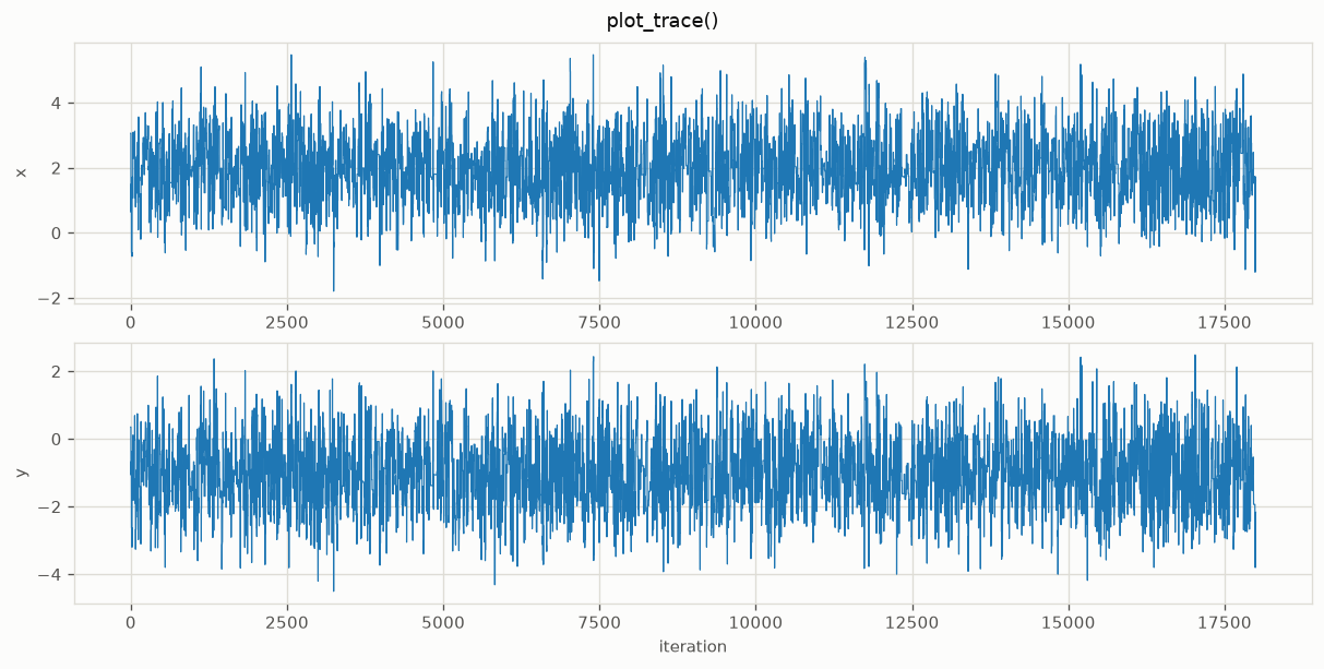
A healthy trace looks like a fuzzy horizontal band. A visible trend means you have not discarded enough burn-in. Long flat stretches mean proposals are being rejected repeatedly and your step size is too large.
plot_autocorr()
How quickly the chain forgets where it was. Correlation should decay to zero; how fast tells you how many iterations one independent sample costs.
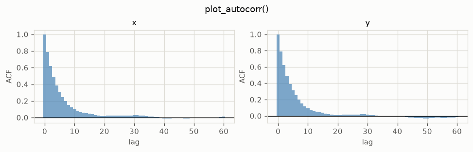
Slow decay means a low effective sample size. Pair it with result.ess() for
the number.
Looking at the posterior
plot_marginals()
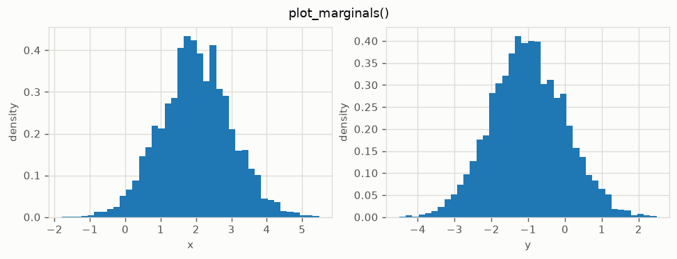
One histogram per parameter. The quickest read on where each parameter ended up and how uncertain it is.
plot_corner()
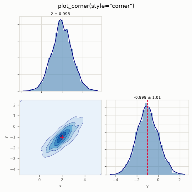
The workhorse. Marginals on the diagonal, pairwise joints off it, so you see both the individual uncertainties and the correlations between parameters. Those correlations matter in model updating: they are what tells you two parameters are trading off and cannot be identified separately.
Pass true_values in a synthetic study to mark the answer.
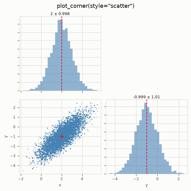
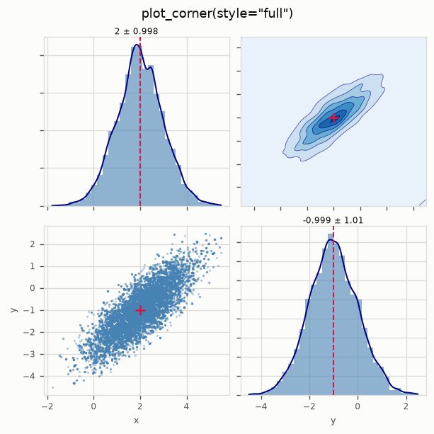
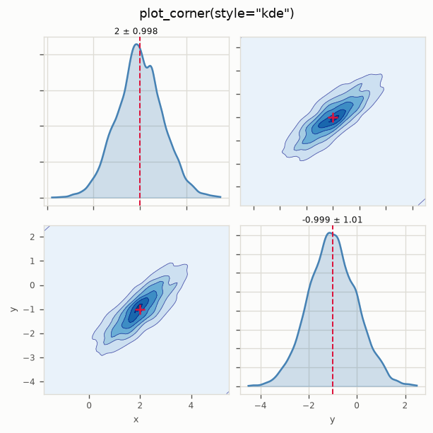
Four styles, same data:
Histogram and KDE on the diagonal, 2-D KDE contours below. The default, and the best general choice.
Histogram on the diagonal, raw scatter below. Use it when you want to see individual draws, including outliers a KDE would smooth away.
Scatter below the diagonal, KDE contours above. Both views at once, for when you cannot decide.
Smooth densities everywhere. The cleanest for a paper figure, and the most willing to hide a sparse or lumpy chain, so check a scatter first.
Tuning: bins for the diagonal histograms, kde_grid for contour resolution,
levels for the number of contours, plus scatter_kwargs, hist_kwargs and
kde_kwargs passed through to matplotlib.
Predictions and the model
posterior_predictive().plot_bands()
Propagates posterior samples back through your forward model, so you can check the fit in the space you actually measured, with honest uncertainty.
pred = result.posterior_predictive(forward_model, n_eval=400)
pred.plot_bands(x=frequencies, y_obs=measurements,
                xlabel="frequency [Hz]", ylabel="amplitude")
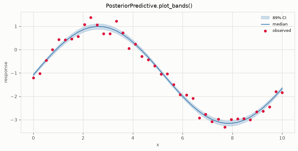
The band is a credible interval, 90% by default via ci=(0.05, 0.95), with the
median as the line. Observed data overlays as points. If the points sit
systematically outside the band, your model is wrong in a way more data will
not fix.
n_eval subsamples the chain, which matters when each forward evaluation is a
finite element solve.
TMCMC.plot_stages()
TMCMC's particle population as it is annealed from prior to posterior. Each panel is one tempering stage, showing the cloud contracting onto the posterior.
tmcmc = mc.TMCMC(n_particles=1000, n_mcmc_steps=3)
tmcmc.run(problem, prior_samples=prior_samples)
tmcmc.plot_stages(max_stages=6)
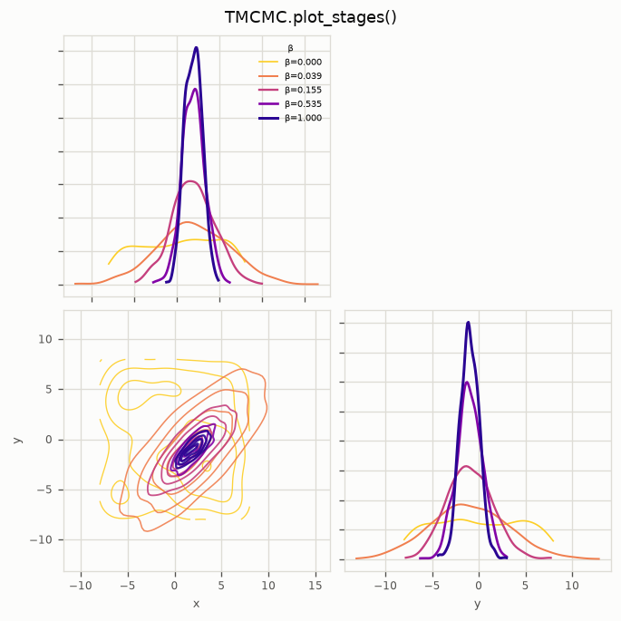
Useful for confirming the schedule is sensible. Stages that barely move mean the tempering is too cautious; a single huge jump means it is too aggressive and particles will have degenerated.
Numbers, not pictures
Plots are for judgement; these are for reporting.
result.mean()            # posterior mean, shape (n_params,)
result.std()             # posterior standard deviation
result.cov()             # full covariance, always (n_params, n_params)
result.quantile([0.05, 0.95])     # credible intervals
result.ess()             # effective sample size per parameter
result.autocorr(max_lag=100)
result.acceptance_rate
And for several chains:
from mcmckit import gelman_rubin, convergence_summary

gelman_rubin([c1.samples, c2.samples])       # want below 1.01
convergence_summary([c1.samples, c2.samples])
Reshaping a result
Both return a new Result, so they chain:
result.discard(2000)                  # drop burn-in
result.select(["k1", "k3"])           # keep a subset of parameters
result.discard(2000).select([0, 2]).plot_corner()
Regenerating these figures
Every image on this page is produced by a script in the repository, so the docs cannot drift from the code: